Help Students Maximise their Efficiency.
Abstract
I listened a university student talking one time about the trouble he was having finding the best courses. He couldn’t get enough information about the courses to know which ones would be a good fit for him. I realized this could be a real struggle for a lot of students. I became curious. I wanted to find out what caused that struggle, and develop a solution. The result was Triklo.
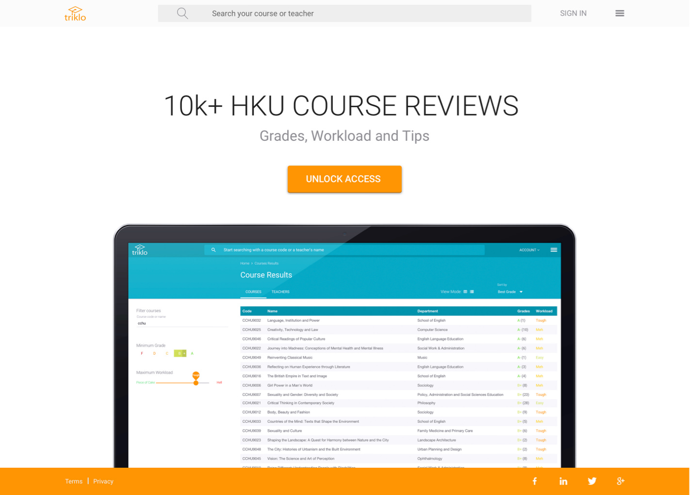
Triklo is a web app which was developed to eliminate the pain and frustration of searching multiple platforms to find courses that are most suitable for the curriculum of each student.
During the process of developing Triklo, I learned a lot about what students need, and the challenges of designing an application which would help them find the most suitable courses.
The project was extremely successful. Students loved it and really embraced Triklo, because they got so much benefit from it. The result – in 2016 the Triklo tech and data were acquired by a non-disclosed HR Agency.
I developed the following process to evaluate the problem, and devise a solution.
Responsibility
As co-founder, I took on a broad range of responsibilities, with a primary focus on product design, UXR and front-end development.
Outcomes and impact
- 25k Active users in Hong Kong
- 35k+ Course Ratings (2016)
- Multiple brand and ad deals
- WHUB Startup Winners
- Successful exit in 2016
Problem
Students struggle to find the right courses which best co-align with their interests, values and standards.

Solution
Triklo is a web app and database. It is specifically designed to help students find the best courses in their university, based on their interested and personal metrics.
Design Process
Understanding which problem to solve
What problems make the course evaluation process difficult for students? I began by identifying what caused students to struggle when evaluating courses.

Identifying Problems. Making Assumptions.
I identified several key problems faced by students. I made assumptions on that basis, and hypothesized that students would value the most when they could:

Research: Conducting a Problem Interview
It was time to hear directly from the students. I conducted student interviews to evaluate the hypotheses I had formed, and turn the results into actual data.
I Interviewed students where they would be comfortable, in informal settings like cafes and university dormitories. The interviews were held in a relaxed fashion, but followed strict guidelines. Below you can see my research plan and script:

After the interviews, I categorized our findings into features which the students considered “must have” and “don’t have but need” features.
The Results Listed in order of preference from “must have” – high priority (1) to “don’t have but need” – low priority (5):

The next step was to translate the data into actual, functioning features. I brainstormed various ideas and listed the pros and cons of each potential feature. I weighed the factors carefully and picked the three most exciting features to implement:

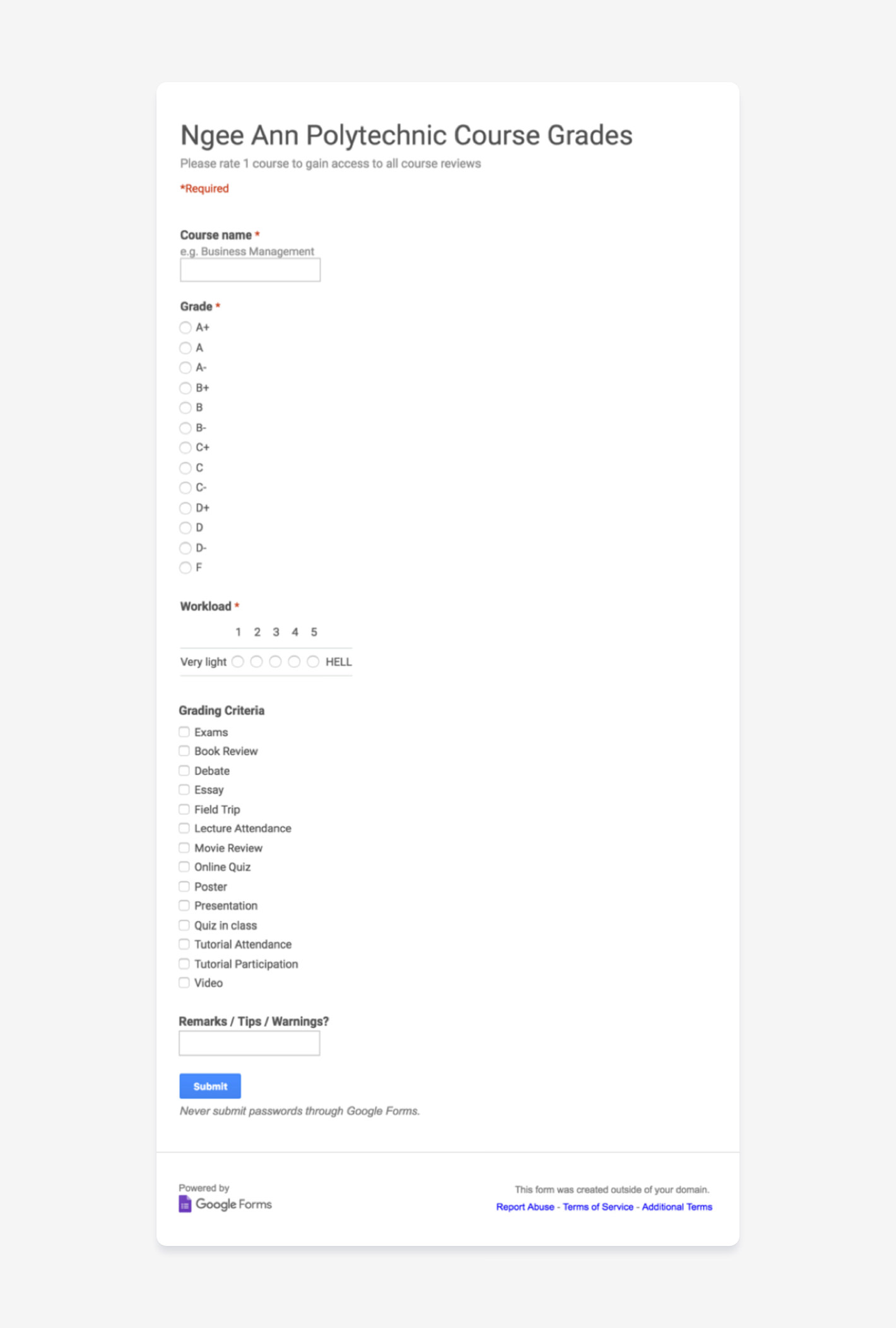
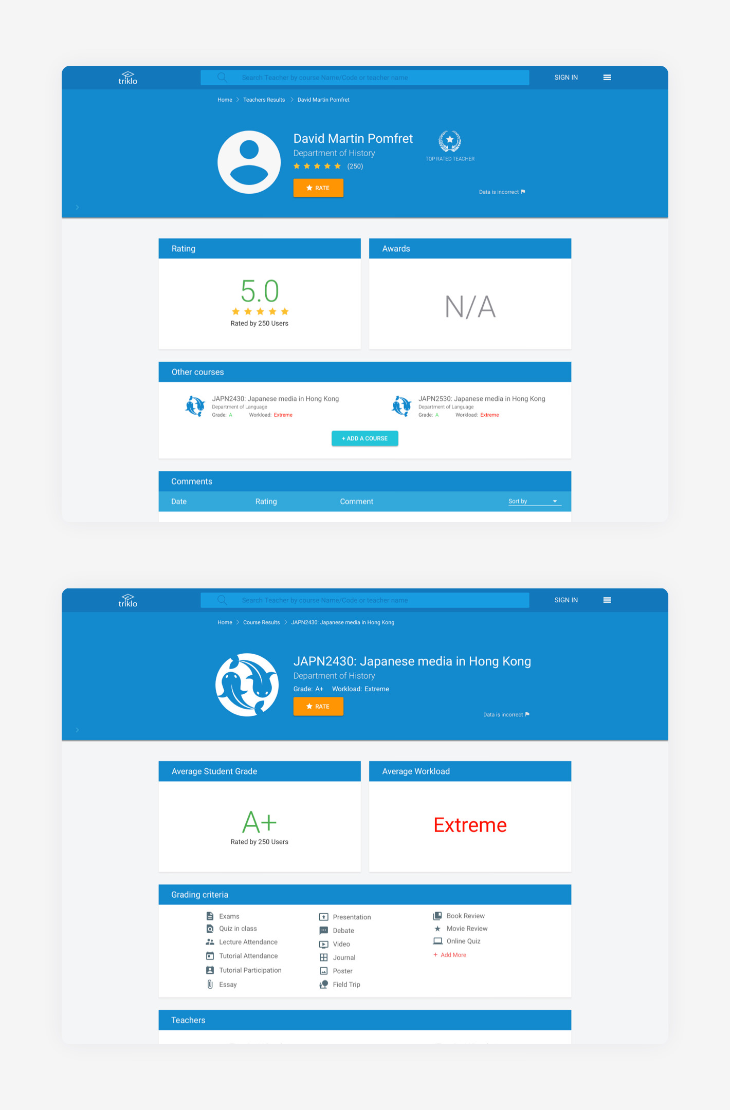
Students were asked for their grades (A-F) and their required workload (Easy to Hard as Hell). This information was used to determine the Quality/Effort ratio. Also, students could rate the professors (1-5 stars).

The student could select the most common ones via a checkbox. If it was not available in the list, they could manually enter it. If enough people do the same process, assessment requirements will be added as a separate category to our system.

Provide a comment section for students to provide their evaluation of a course.
Users Surveys: A little teaser
Before I began to design the system, I surveyed users to quantitatively verify the feasibility of our website’s features.
The survey was performed through an online questionnaire using Google Forms. Upon completion, students had access to the survey results in the form of a table and infographics.
We published the survey on Facebook. The response was overwhelming. Within two days we received 1250 ratings. This proved that there was a high demand for our system! The process was definitely worth development.
The Design Phase: Lo-Fi Wireframes
I translated our data into functional features with one goal in mind: to make the process of rating and finding the right course as easy as possible.
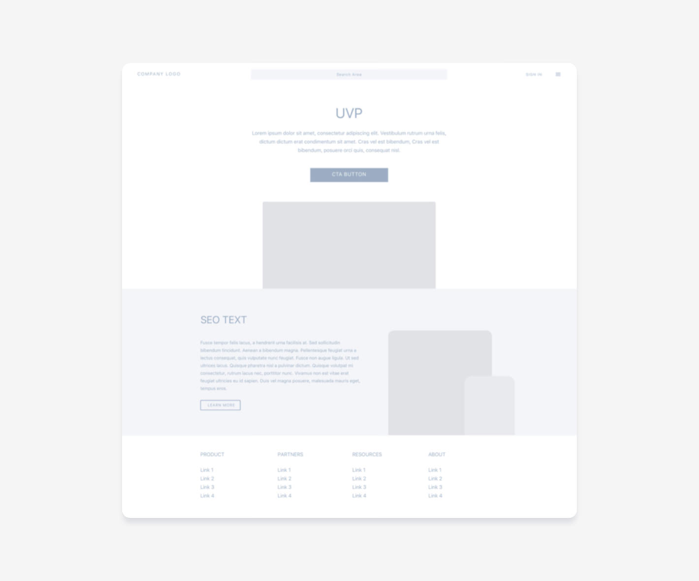
Next, I designed the wireframe layout using Sketch and AXURE.
The Design Phase: Hi-Fidelity Prototyping
I finalized the wireframes and tested them for their UX. Then I converted them into a high fidelity prototype using Sketch and InVision.
Metrics: Efficiency Analysis
Allowing the student to leave ratings of courses and professors is essential to Triklo. I used Cogtool, a predictive performance modelling tool, to optimize this process and be able to predict the time students took to leave ratings.
I conducted A/B testing with six users. To achieve the best results, I made slight design changes to test the speed and quality of rating, which is quantified by the key performance indicator (KPI).
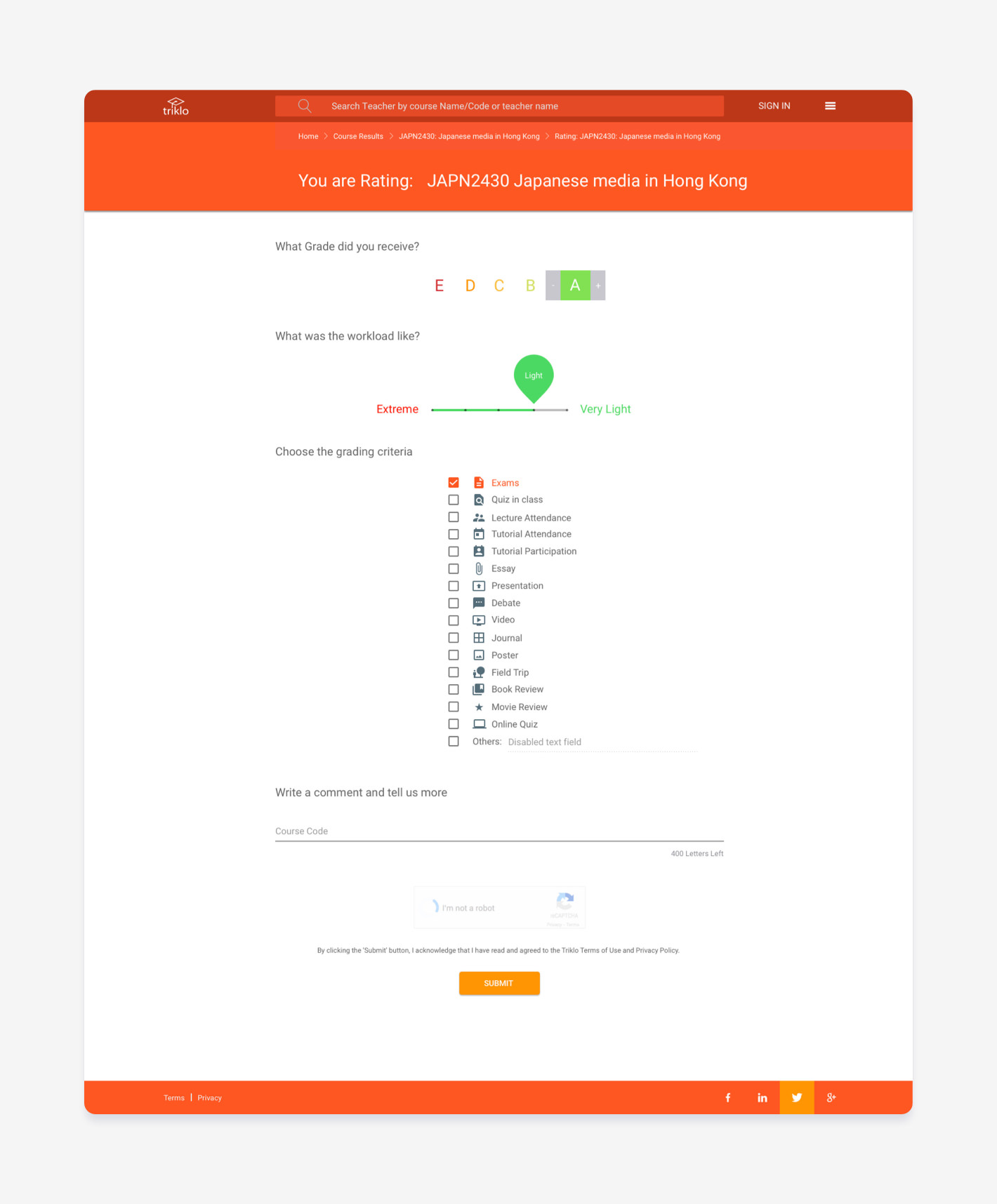
Course review page
Designed and optimised for quick and fast course reviews.
Pilot User Study: Think-Aloud
With the high fidelity prototype, I conducted a qualitative think-aloud study with follow-up interviews. Ten participants were involved. The experiment set out to test the usability and usefulness of Triklo. I set up the study, then just listened as the students told me what was important for them.

Results and Data Analysis
I carried out a thematic analysis on the user responses by colour-coding each theme. I sorted them according to 1) Findings 2) Usability Issues and 3) Thoughts and Feelings.
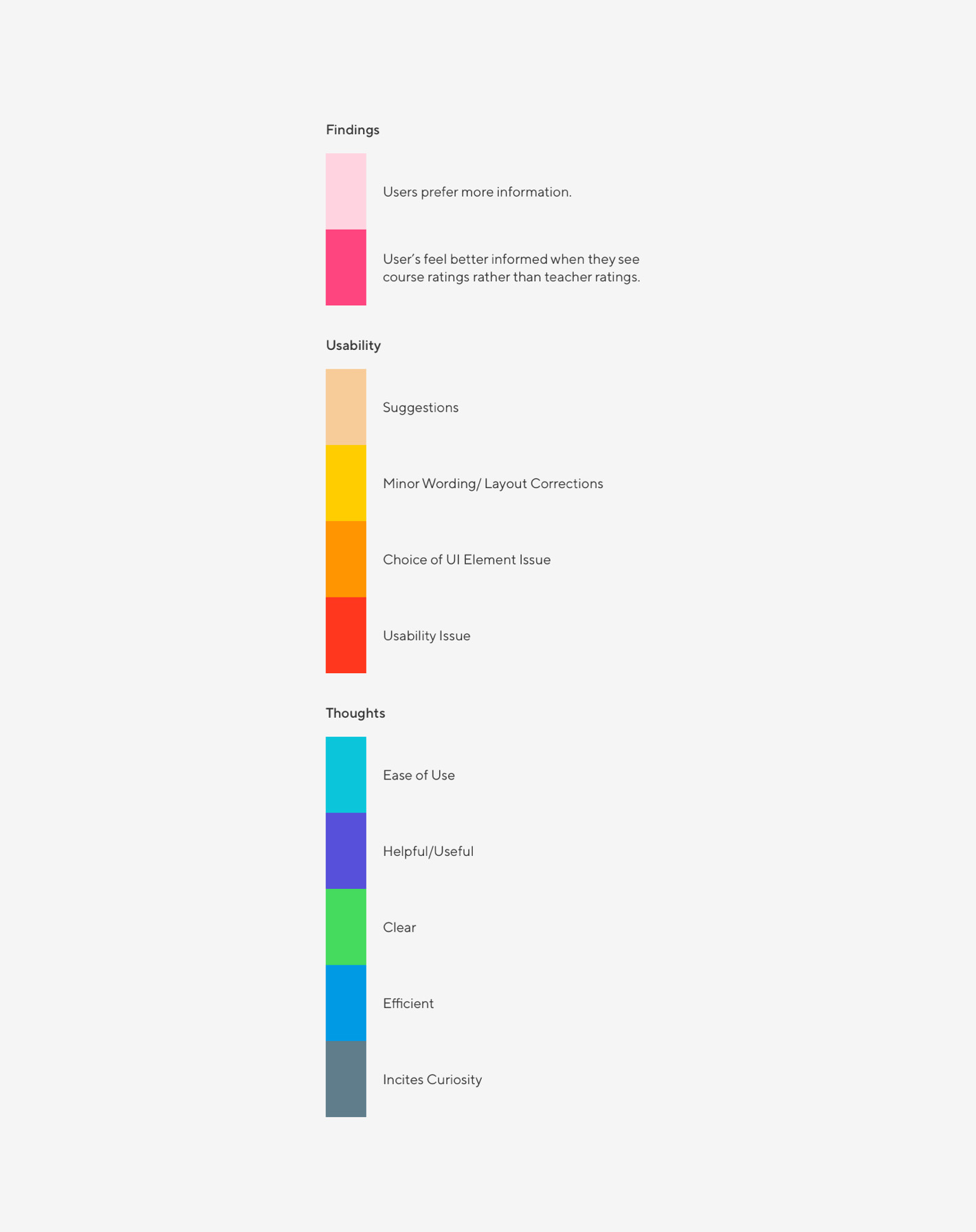
Findings:
- Participants felt that having more comments on display, made the page more informative.
- They also preferred the site to focus more on courses rather than teachers.
- These findings will help shape my design of the application, which is the benefit of testing features with real users.
Usability Issues:
I detailed usability issues which came up with the tests, and assigned a severity rating to each one (using Nielsen’s guidelines). I wrote down ways in which I could solve these issues.
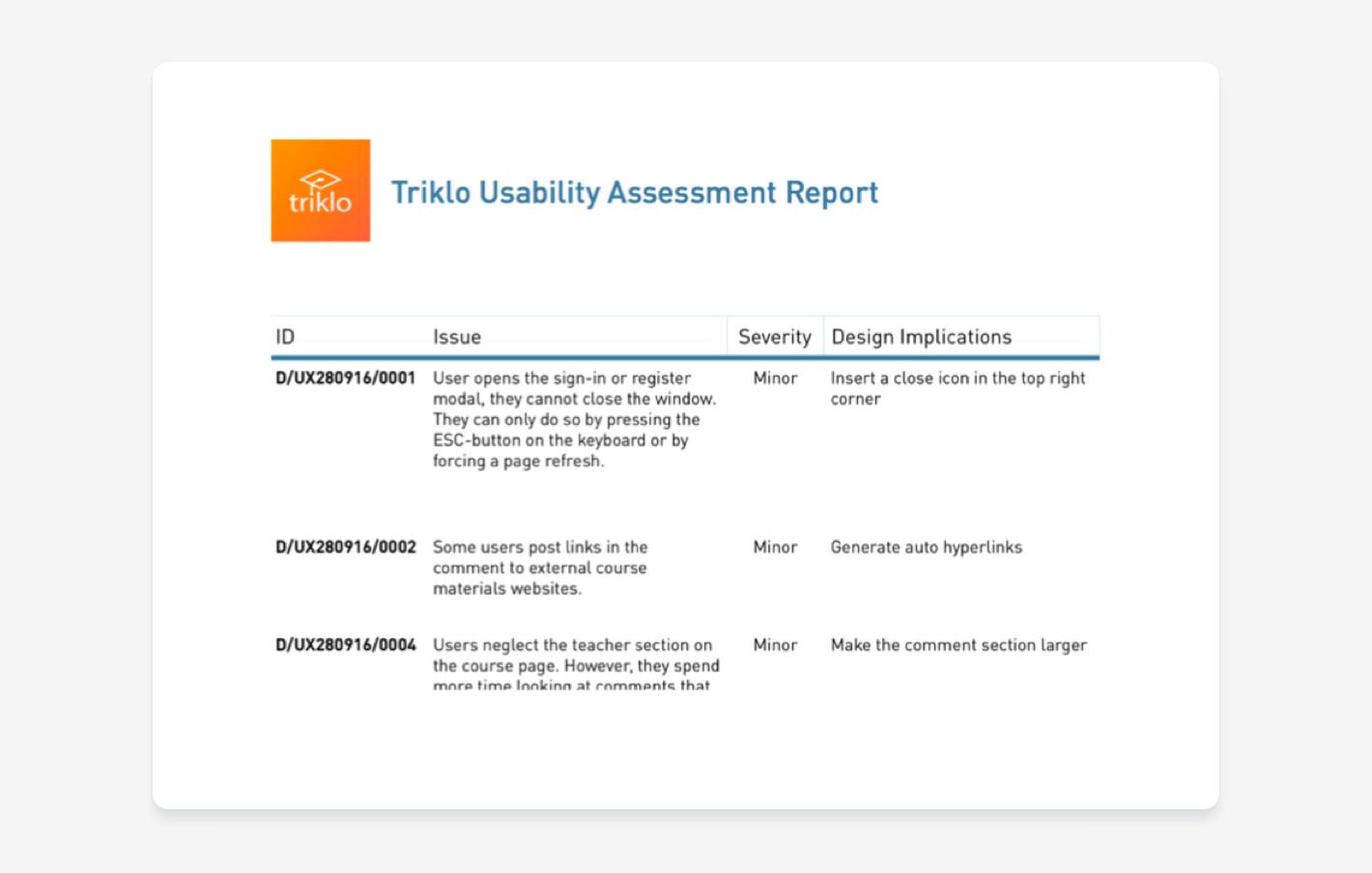
Usability Severity Rating
Jakob Nielsen devised 113 guidelines for ensuring homepage usability. I used those as a basis for analysing the problems at hand and finding solutions.
Thoughts and Feelings. Participants felt that:
- Triklo’s interface was easy to use and understandable
- The platform made the relevant content stand out
- They also highly preferred Triklo’s interface to RateMyProfessor’s
Reflection and Learnings
The UX process is amazing
I learned a lot about the UX process and all the logistics that go into launching a product. Creating an entirely new platform is both complex and fun! We developed a process that helps students find the best class, and that is an outcome I am very pleased about.
During the user research process, I was genuinely surprised to see how many users had a completely different understanding of what determined a course to be “excellent.” MY UX strategy completely changed early on when I learned that grades and workload are the primary criteria on which students based their course choice.
The project had many challenges, and was complex for me in particular, because I am the Co-founder and Head of UX/UI for Triklo. I was responsible to develop the visual elements, the front-end, and to design the product. This included tasks from developing an Information Architecture, to engineering User Interface elements. I conducted and evaluated multiple UXR Tests to improve the product both before and after deployment. I also had to mentor and lead team members and manage both the product and the company.
It was difficult to communicate with our remote users. Thankfully, I was able to conduct all the qualitative and quantitative tests online. At the start of the project, we averaged 30 users on peak days. After the redesign and close evaluation of the grading criteria, we saw a 1000% increase in users! We also saw a dramatic rise in ratings provided each semester.
The whole project was an essential learning experience, and I especially loved creating designs and testing those on users. This feedback loop helped take out the ambiguity of whether a feature would be useful to students. It felt good to produce designs with the confidence of knowing that users would enjoy and understand them, and more importantly – would use them to their benefit.
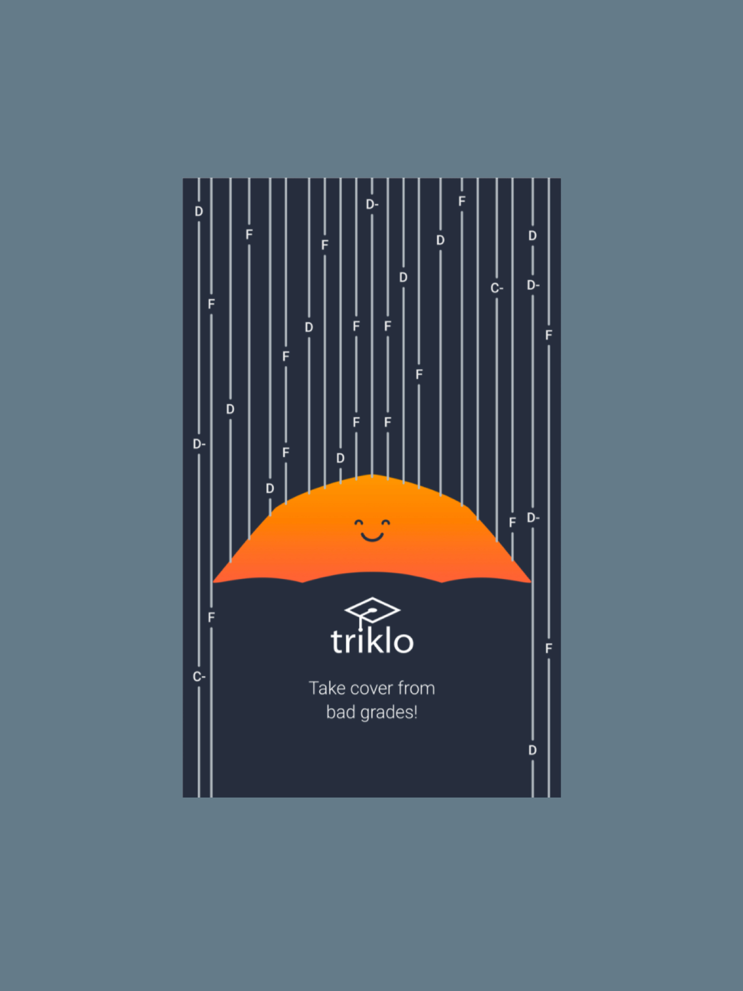
Campus Poster Take cover from bade grades
I designed multiple posters for campuses in Hong Kong